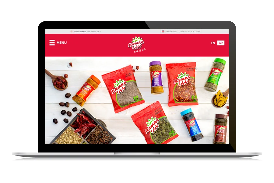


We wanted to create a website that highlighted the delicious range of products that Bayara has to offer. The website was to be a portal into the world of Bayaraflavours. The imagery of the website had to evoke and match the aesthetics of the brand and its products.The navigation should be as simple as possible, to keep the products at the front and centre of the focus.
The Bayara website had to be both informative and aesthetically pleasing, introducing users to the extensive selection of Bayara products.With such a vast range of offerings, every product of Bayara required equal importance and space on the website. This forced us to revisit the typical design idea of a website and explore options that helped make every product stand out.
A website should represent the brand in the way it wants to be seen – it is after all the digital face of the brand!
That’s what led to the uniquely wholesome look and feel of the Bayara website. We created a website framework that took users straight into the browsing experience, while being warm and welcoming. With a fluid and efficient interface, all the categories are clearly defined by their relevant sections.Our approach was to work with themes and motifs that reflected not just the product, but also a lifestyle. The final build of the website shows off the brand’s high quality of products and its wide variety of offerings.
From nuts to spices and snacks, the Bayara website looks bright, fresh and full of life!